Tips & Tricks to Amp Up your Designs: Photoshop Filters & Layers
An extremely interesting, fun, yet often underrated and ignored tool in Adobe Photoshop is the filter effects tab in the layers panel, as seen here:
To demonstrate just how these filters can effect photos in particular, we will be using these images from unsplash.com:
Left photo courtesy of Ryan Wilson on Unsplash.com, Right photo courtesy of Tim J on Unsplash.com
Here are these photos edited so that the ocean image featured above is layered on top of the city image featured next to it with the various filter effects applied to the layered images:
Darken:
Multiply:
Color Burn:
Linear Burn:
Darker Color:
Lighten:
Screen:
Color Dodge:
Linear Dodge:
Lighter Color:
Overlay:
Soft Light:
Hard Light:
Vivid Light:
Linear Light:
Pin Light:
Hard Mix:
Difference:
Exclusion:
Subtract:
Divide:
Hue:
Saturation:
Color:
Luminosity:
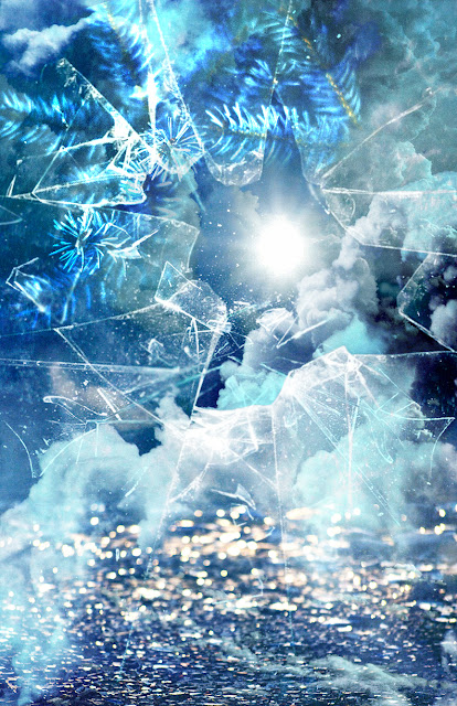
As you can see, these various filters have some really intense, yet interesting effects on the photos shown here. However, used sparingly and with some help from adjusting the opacity of the layers the filters are applied to, you can achieve some wonderfully subtle effects as well. Your work can also be made more interesting by using multiple photos and effects as seen in my piece here:
This image is actually a compilation of images of pine tree branches, clouds, the sun in the sky, and broken glass. For context, this piece is meant to represent and describe the season of winter without using traditional images of snow, snowmen, snowflakes, or ice.
Each image of glass, tree branches, etc. was cropped and layered on top of each other one at a time and filters and edits added to each photo as I added it to the piece.
I encourage you to try these filters out if you have photoshop and are an aspiring (or even working) designer who may have forgotten about these filters!


I found this blog post to be super interesting! I have very minimal experience with photoshop, but am definitely interested in trying out these techniques. Also, all of these photos just look incredible. -Marisa
ReplyDeleteThese images are great! First, I was wondering if you had a favorite filter that you enjoy using when creating images? I normally never edit photos because I'm always worried I will do too much or will alter what the photo looks like too much. That being said these are some great options, and especially for me because I do know very little about photoshop. - Laurel
ReplyDelete